
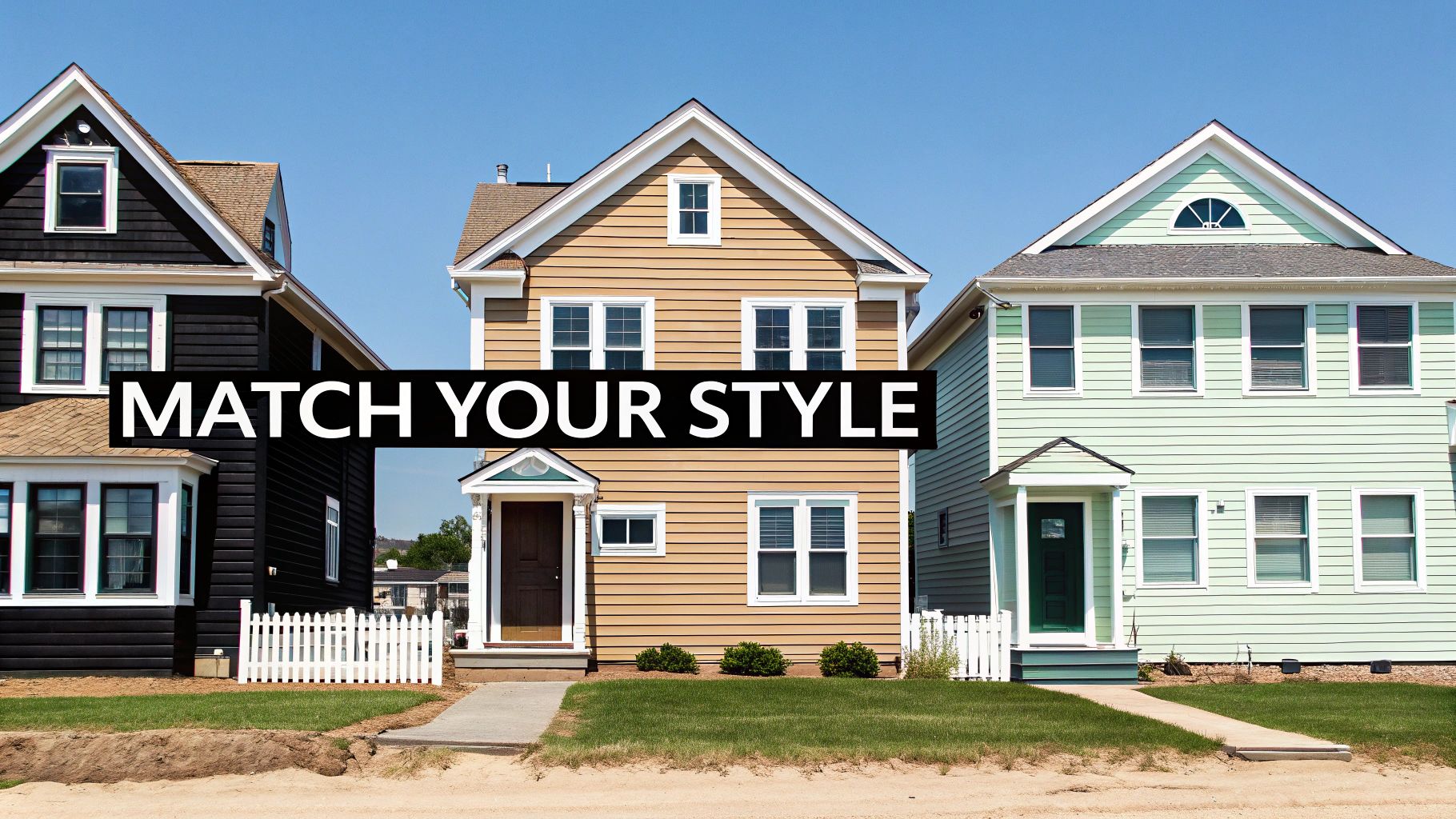
Choosing the right exterior paint colour is one of the most powerful things you can do to boost your home's curb appeal and, ultimately, its resale value. While popular choices often lean towards timeless neutrals like warm whites, soft greys, and earthy tones for their broad appeal, this isn't just about picking a colour you like. It's a strategic decision that can pay off big time.
The True Power of Your Home's Exterior Colour

Think about it: your home's exterior is the very first thing potential buyers see. It’s a visual handshake, setting the stage for what's inside. A tired, dated, or just plain wrong colour scheme can hint at neglect, whereas a fresh, thoughtfully chosen palette instantly says "well-maintained and desirable." This is where the psychology of colour really kicks in.
A crisp white can feel modern and clean. A deep charcoal can bring a touch of sophistication. And in a place like Mandurah, a soft blue-grey might perfectly capture that relaxed, coastal lifestyle buyers are looking for. These feelings are massive drivers in the real estate market, directly shaping how buyers perceive your home’s value before they've even stepped out of the car.
More Than Just Paint
The investment in quality paint and a well-considered colour scheme is a huge deal in the broader Australian property market. In fact, the national paints market is valued at a massive AUD 2.56 billion, which shows just how much homeowners prioritise presentation. With renovations and new builds constantly underway, Aussies are using paint not just for protection but as a key tool to get the best possible price for their property.
This strategic approach to aesthetics is fundamental when preparing a home for sale. Honestly, it's one of the most cost-effective upgrades you can make, often delivering a substantial return on your investment.
Your home’s colour palette is its handshake with the world. A great paint job does more than protect your home from the elements; it communicates value, style, and care before a buyer even steps through the door.
By selecting the right exterior painting colours, you’re making a calculated move to stand out in a competitive market. It’s a critical piece of the puzzle, and if you want to see how it fits into the bigger picture, you can learn more about how to increase home value through other smart updates.
Matching Paint Colours to Your Home's Architecture
Before you fall in love with a trendy charcoal or a classic cream, take a step back and really look at your house. Your home's architectural style is the single most important guide you have for choosing exterior paint colours. It’s a built-in roadmap, suggesting palettes that will feel authentic and enhance its best features, rather than fight against them.
Think of it this way: a sleek, modern home with sharp lines and huge windows can handle bold, contrasting colours like a crisp white with black trims. It works. But that same stark scheme on a charming Federation-era cottage with intricate fretwork would just look wrong. That style of home calls for softer, heritage-inspired palettes to highlight its unique character.
Reading Your Home's Style Guide
Every architectural style has its own personality. The key is to select colours that honour that identity. Don't just paint your house; dress it in a palette that makes sense for its design.
For Mandurah’s ever-popular coastal or Hamptons-style homes, the goal is to create a light, airy, and relaxed feel. This means leaning into specific colour families:
- Whites and Off-Whites: Think soft, warm whites like Dulux Natural White or Snowy Mountains Half. These are crucial for avoiding that sterile, blinding look a pure white can give off under the bright WA sun.
- Soft Greys and Greiges: Colours like Dulux Tranquil Retreat or Shale Grey offer a gentle, sophisticated alternative to white that still feels fresh and modern.
- Muted Blues: A classic for a reason. Hues like Dulux Milton Moon or Blue Metal are a nod to the nearby ocean and create a serene, welcoming facade.
If you have a more contemporary build, you can afford to be a bit more dramatic. A deep grey like Dulux Domino on a feature wall or garage door can create a powerful, grounded look, especially when you pair it with natural timber accents.
Look Beyond Your Property Line
Your home doesn't exist in a vacuum. The colours you choose should also feel harmonious with your immediate surroundings—this includes both the natural landscape and the overall vibe of your neighbourhood. Take a walk down your street. Are the homes mostly neutral and earthy, or is there a mix of bolder colours?
While you want your home to stand out, you don't want it to stick out for all the wrong reasons. A colour that feels jarring compared to its neighbours can actually detract from the overall street appeal.
A great exterior colour scheme makes a home look like it truly belongs. It should complement the architecture, feel appropriate for the neighbourhood, and harmonise with the natural landscape, from the coastal light to the local flora.
The goal is to find that perfect balance. You want a colour that reflects your personal style and enhances your home’s architecture while still respecting the community's aesthetic. This thoughtful approach not only boosts curb appeal but also plays a vital role in presentation when it's time to sell.
To learn more about getting your property market-ready, explore our comprehensive guide on staging your home for sale. Honestly, choosing the right paint is one of the most foundational steps in that entire process.
How Climate and Sunlight Affect Your Colour Choice
Picking exterior paint colours here in Mandurah is about more than just what looks good on a swatch. It’s a practical decision, and our beautiful, sunny climate is the biggest factor you need to consider. The sheer intensity of the Western Australian sun can completely change how a colour looks and, more importantly, how it holds up over time.
It really boils down to a simple principle: light colours reflect sunlight and heat, while dark colours soak them up. This isn't just theory; it's why you see so many stunning homes painted in whites, soft greys, and warm creams all along our coastline. These lighter shades do a brilliant job of keeping the inside of a house cooler, which can make a real difference to your power bills in the middle of summer.
On the other hand, those dark, dramatic colours like charcoal or a deep navy can look incredibly sharp, but they come with a big catch in our high-UV environment. They absorb a huge amount of heat, which can lead to fading, chalking, and in some cases, even cause certain types of cladding to warp. A bold colour that looks amazing on day one can end up looking tired and washed out in just a few years.
Understanding Light Reflectance Value
To get a bit more technical without getting lost in jargon, there’s a term you should know: Light Reflectance Value (LRV). Every single paint colour is given an LRV rating on a scale from 0 (absolute black) to 100 (pure white). This number simply tells you how much light that specific colour reflects.
- High LRV (above 60): Think light colours. They bounce back more heat and light, making them perfect for the main body of a house in a sunny place like ours. They're more energy-efficient and far more resistant to fading.
- Low LRV (below 25): These are your dark, heat-absorbing colours. They are absolutely fantastic for creating contrast on accents like a front door or window trims, but I'd generally advise against using them for the entire exterior in our climate.
For example, a modern coastal home might use a crisp white with a very high LRV to reflect the intense sun and better withstand the salty air. A house nestled in a leafy, more established suburb, however, might get away with warmer, earthy tones with a slightly lower LRV because it benefits from more natural shade.
Choosing a paint colour is an exercise in predicting its future. In a sunny climate, light colours with a high LRV are your best bet for longevity, energy efficiency, and maintaining that fresh, just-painted look for years to come.
Colour Performance in Australian Climates
The Australian sun is harsh, and your colour choices directly impact your home's long-term appearance and maintenance needs. This table breaks down how different colour families perform under our typical climate conditions.
| Colour Family | Heat Absorption | Fade Resistance (UV) | Best Suited For | Maintenance Level |
|---|---|---|---|---|
| Whites & Creams | Very Low | Excellent | Full exteriors, especially in coastal or hot, sunny areas | Low |
| Light Greys | Low | Very Good | Versatile for modern or classic full exteriors, trims | Low to Medium |
| Pastels & Neutrals | Low to Medium | Good | Main body colours, coastal themes, feature walls | Medium |
| Dark Greys & Blues | High | Fair | Accents, front doors, trims; shaded areas | High |
| Deep Reds & Blacks | Very High | Poor | Small accents only; not recommended for large surfaces | Very High |
As you can see, lighter colours consistently offer better performance and lower maintenance, making them a safe and stylish bet for most WA homes.
This practical approach ensures your home not only looks fantastic but is also perfectly suited to its environment. Of course, the best colour in the world won't last if it's not applied correctly. If you're looking for professional painters to get the job done right, our guide on navigating local trades in Mandurah is a great place to start your search for reliable experts.
Creating a Cohesive Look with Trims and Accents
A truly stunning exterior is never about just one colour. It’s the smart combination of shades that creates that polished, intentional look. Your main wall colour might be the star of the show, but it needs a strong supporting cast—your trims, accents, and even fixed elements like the roof and stonework—to truly shine.
This is where a lot of homeowners get a bit stuck, but there’s a simple guideline that professionals swear by. It’s often called the 'three-colour rule', and it’s a brilliant, straightforward way to build a palette that feels balanced and sophisticated.
The Classic Three-Colour Rule
Think of this less as a strict law and more as a powerful framework for choosing exterior paint colours. It’s all about giving each colour a specific job.
- Main Colour (70%): This is your dominant shade, the one covering the largest areas like your weatherboards or rendered walls. It sets the whole mood.
- Trim Colour (20%): Used for window frames, fascias, and door casings, this colour’s job is to create definition. It frames the main colour, and a crisp white or a soft grey are timeless choices that always work.
- Accent Colour (10%): This is where you get to inject a bit of personality. It’s reserved for the front door, shutters, or maybe a small architectural detail, adding that final pop of character.
Let's picture a modern coastal home here in Mandurah. You could have a soft, warm grey for the main walls. The trims? A clean, sharp white to make everything pop. And for the front door, a deep, welcoming navy blue that adds just the right amount of interest without being too loud.
Working with Fixed Elements You Cannot Change
Often, the trickiest part of pulling a scheme together is dealing with the things you can’t change. Your roof colour, any existing brickwork, stone retaining walls, or even your driveway—they are all permanent parts of the colour palette. The key is to work with them, not fight against them.
If your home has a classic charcoal or dark grey roof, you're in luck. That neutral base works beautifully with almost any main colour, from warm whites and greiges to muted blues and greens.
On the other hand, if you've got exposed red or orange brick, you'll want to lean into warmer tones. A creamy off-white or a soft taupe will harmonise with the earthy colours in the brick far better than a cool, stark grey, which can often look jarring and out of place.
The secret to a professional-looking exterior is harmony. Your new paint shouldn't just cover the walls; it should actively complement the permanent features of your home, from the roof tiles down to the paving stones.
Choosing Your Trim and Accent Colours
Getting the trim right is absolutely crucial. A popular direction in Australia right now is a move towards timeless, nature-inspired schemes. In fact, painting experts are seeing a strong preference for soft greys and warm whites on main walls, which are then elevated with bolder trim colours like navy or forest green for a touch of character. For a bit of inspiration, you can see more about these current paint colour trends in Sydney homes.
When it comes to your front door, this is your moment to make a statement.
A bold accent can completely change the feel of your home's entrance, making it more inviting and memorable. A bright colour draws the eye, creating a clear and welcoming focal point. It's a small detail with a massive impact on curb appeal.
Never Skip the Crucial Paint Testing Step
Trying to pick a colour for your entire house from a tiny, two-inch paper swatch is a huge leap of faith. Honestly, it’s a recipe for expensive regret. This is exactly why the single most important part of choosing your exterior colours is the testing phase. It’s a non-negotiable step that separates a pretty good result from a truly great one.
The only way to do this right is to head out and buy sample pots of your top contenders. Forget painting tiny, indecisive dabs on the wall; you need to paint large, one-square-metre patches to get a genuine feel for the colour. This isn't just about seeing if you like the shade—it's about seeing how that shade lives and breathes on your specific property.
How to Test Your Colours Like a Pro
To get the full picture, you have to watch how the colour shifts with the light. The bright, direct sun of a Mandurah morning is completely different from the long, soft shadows of the late afternoon.
Here’s what I always tell my clients:
- Paint multiple patches: Apply your large test patches on at least two different sides of your home. Pick one that gets blasted with full morning sun and another that catches the afternoon glare.
- Observe throughout the day: Pop outside and check on the colours at different times. How does that soft grey look at 9 am versus 4 pm? Does that warm white suddenly throw off a yellow tinge when the sun sets?
- Check against fixed elements: Stand back on the kerb and see how the patch interacts with your roof tiles, window frames, and even the driveway. Does it harmonise beautifully, or does it clash?
A paint colour doesn't really exist until it's on your wall, interacting with your home's unique light and surroundings. Think of sample pots as your insurance policy against a costly and disappointing mistake.
This simple observation process is the key to feeling totally confident in your final choice. It takes all the guesswork out of the equation and ensures the colour you’ve picked is one you’ll be happy with for years to come.
Visualising Your Final Palette
To help you structure your choices, it’s useful to think about the classic three-colour rule: a main colour for the body of the house, a secondary colour for trims, and a little pop of accent colour for personality (think the front door).
This simple infographic breaks down how to build a balanced exterior colour scheme.
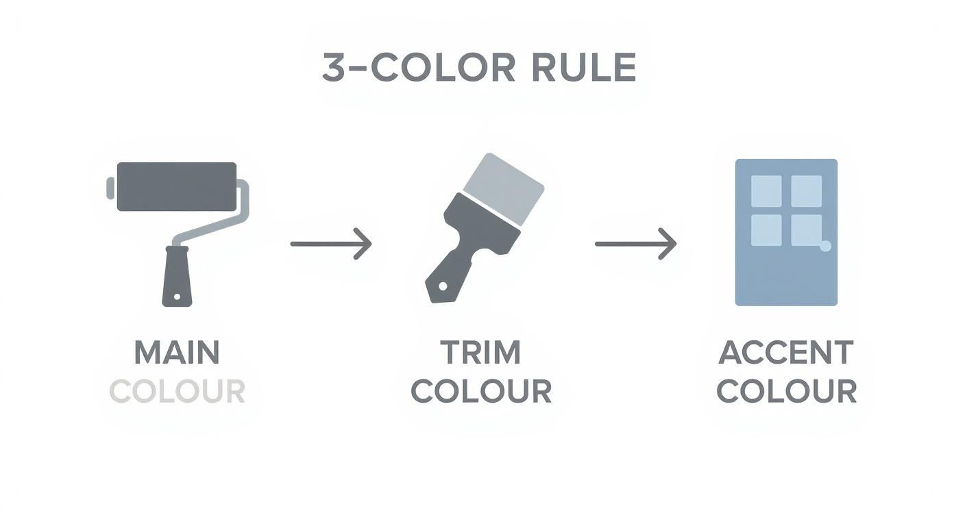
Thinking about your home with these three distinct roles helps create a cohesive, professional-looking facade that will seriously boost its curb appeal.
Even after you’ve narrowed down your choices, a few final questions always seem to pop up. It’s completely normal. Choosing your home's exterior colours is a big commitment, but a little expert insight can give you the confidence to lock in your final decision. Let's run through some of the most common queries we hear from homeowners at this stage.
How Many Exterior Colours Should a House Have?
It can be tempting to get carried away with the colour chart, but when it comes to painting your home’s exterior, less is definitely more. For a professional, polished look that will stand the test of time, stick to a three-colour scheme.
This classic approach creates a balanced and intentional look without overwhelming the eye. It’s a tried-and-true formula that works beautifully on almost any style of home.
- Main Colour: This is your base, covering the largest surface areas like your walls, and it sets the overall mood.
- Trim Colour: Used for things like window frames, fascias, and eaves, this colour defines the home’s features and frames the main shade.
- Accent Colour: This is where you can add a pop of personality. It’s reserved for the front door or maybe the shutters, creating a welcoming focal point that draws people in.
Sure, a highly detailed heritage home, like an intricate Queen Anne, might get away with a fourth or even fifth colour. But for the vast majority of homes, three is the gold standard. It’s the key to a clean, cohesive finish that seriously boosts curb appeal.
A well-executed three-colour palette is the secret to a professional-grade exterior. It provides depth and character without creating visual clutter, ensuring your home looks thoughtfully designed and appealing to potential buyers.
Think of it as a simple framework. It helps you make deliberate choices instead of just adding colours for the sake of it, and it's the surest way to guarantee a harmonious result.
What Is the Best Exterior Paint Finish?
The finish you choose is just as critical as the colour itself, especially when you’re up against the harsh Australian sun and weather. The sheen level doesn't just affect the final look; it plays a huge role in the paint's durability and how easy it is to keep clean.
For the main exterior walls, a satin or low-sheen finish is almost always your best bet. This finish has a subtle lustre that’s far more durable and easier to wash than a flat or matte finish, which tends to grab onto dirt and can be a real pain to clean.
At the same time, it’s not so glossy that it highlights every tiny imperfection on the surface—a common issue when you use semi-gloss or high-gloss paints on large, flat walls.
For the other elements of your home, it pays to mix it up:
- Trims and Fascias: A semi-gloss finish is perfect here. Its higher sheen gives it excellent resistance to moisture and daily wear. Plus, it creates a crisp, clean contrast against the low-sheen walls.
- Front Door: Go with a semi-gloss or even a full-gloss finish for your front door. It makes that accent colour really stand out and can handle the constant use a front door gets.
Should Gutters Match the Roof or the Trim?
This is one of the questions we get asked most often. And honestly, there’s no single "right" answer, but there is a clear trend towards one particular choice, especially if you're aiming for a modern look. Your decision here has a subtle but significant impact on your home's roofline.
These days, the most common and contemporary approach is to match your gutters to your roof colour. This creates a seamless, unified look across the top of the house, making the roofline appear clean and uncluttered. It helps the gutters visually blend in, which is exactly what you want for a sleek, modern aesthetic.
The other option is to match the gutters to your trim colour. This can create a distinct "framing" effect around the entire home and can work well on more traditional architectural styles. The downside? It can sometimes make the roofline feel a bit heavy or busy.
If you're aiming for a clean, updated look that will appeal to the widest range of buyers, matching your gutters to your roof is the safest and most effective strategy.
Choosing the right colours is a vital step in maximising your property's value. If you're preparing your Mandurah home for the market and want an expert opinion on what buyers are looking for, David Beshay Real Estate can help. Get a professional, no-obligation property appraisal to ensure your home makes the best possible first impression. Book your free appraisal today.

